 >Ecommerce Website Development> From Storefront to Sales: The Method of Building High-Converting eCommerce Website Designs
From Storefront to Sales: The Method of Building High-Converting eCommerce Website Designs
Setting up an online store is the easy part. Getting people to actually stick around, trust the brand, and hit Buy Now - that's where things get hard.
A good ecommerce site isn't just a digital catalogue with a checkout bolted on. It's a journey, planned with real intention, that figures out what customers actually want, clears away whatever's holding them back, and makes each step toward buying feel like the obvious next move. At GL Infotech, that means bringing strategy, creativity, technology, and a real read on how people actually use digital products into the same room.
So what separates a store that just exists from one that converts? Mostly, it comes down to how much thought went into every piece of the experience.
Start with Strategy, Not Screens
Before any eCommerce Website Design work begins, the first job is understanding who's actually going to use the thing. A gorgeous interface doesn't count for much if it never answers the customer's real question.
Worth figuring out early :-
-Who your ideal customers actually are
-What they need, and what's pushing them to look in the first place
-What problem your product solves for them
-Why they'd pick your brand over the next tab they have open
-What might stop them from finishing the purchase
That groundwork is what everything else - structure, content, navigation, the whole visual direction - ends up resting on.
Create a Journey That Feels Effortless
Nobody should be sitting there wondering where to click next. Good eCommerce Website Development treats the whole path - landing page, browsing, cart, checkout, confirmation - as one connected thing, not a series of separate stops.
A structure that actually works usually has :-
-Clear product categories
-Search that's visible and actually useful
-Navigation that doesn't need explaining
-Product listings that are organized, not just listed
-A cart that's easy to find and adjust
-Checkout that doesn't ask more than it needs to
Basically: fewer decisions the customer has to stop and think about means more of them make it to the end.
Make Product Pages Do the Selling
The product page is usually where interest turns into "yeah, I'm getting this." A strong eCommerce Website Design gives customers what they need to feel sure about the purchase, without burying them in it.
That means :-
-Photography that's actually good, not just present
-Benefits and specs stated clearly
-Descriptions that are short but do real work
-Reviews and ratings customers can see
-Pricing and stock status right there, no digging
-A call to action that isn't hiding
-Delivery and returns info within easy reach
Treat the product page like a salesperson standing at the counter - it should be answering questions before they're even asked, and giving people a clear reason to say yes.
Design for Trust, Not Just Beauty
People think twice before spending money somewhere new, and that hesitation is completely reasonable. A solid eCommerce website development strategy builds trust at every stage of the journey, not just on the About page.
Clear return policies. Secure payment. Reviews that read as genuine. Contact information that's actually findable. Honest delivery timelines. Product photos that show the real thing.
None of these alone builds trust. It's the accumulation—dozens of small signals adding up to "okay, this is safe."
Make Mobile Experience a Priority
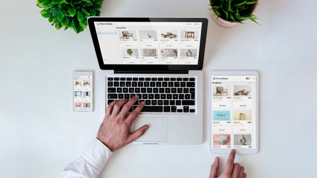
Someone might spot your product on their phone during lunch, compare prices on a laptop that evening, and finally buy from a tablet on the couch. The store needs to hold together across all three without feeling like three different stores.
A thoughtful eCommerce Website Design pays attention to :-
-Pages that load fast, not eventually
-Layouts that actually respond to screen size
-Buttons sized for thumbs, not cursors
-Product info that's readable without zooming
-Navigation that makes sense on a small screen
-Forms and checkout that don't fight you
This isn't just shrinking a desktop site down. It's rethinking the whole thing for a smaller screen and a much shorter attention span.
Remove Friction from Checkout
By the time someone reaches checkout, they've already decided they want to buy. Losing them there, to something as fixable as a confusing form, is about as avoidable as ecommerce problems get.
Solid eCommerce website development keeps checkout lean—fewer fields, guest checkout as an option, costs shown upfront, payment methods people already trust and recognize.
Before launch, walk through it yourself, start to finish. Add something to the cart. Change the quantity. Try a coupon code. Enter an address. Actually pay. Every extra click along the way is one more chance for someone to give up and leave.
Speed Is Part of the Experience
Even a genuinely great eCommerce Website Design falls apart if the pages take forever to load. People expect stores to respond fast, especially when they're comparing several products in a row.
Oversized images, too many scripts, weak hosting, plugins nobody really needs - all of it adds drag. Compressing assets, cleaning up code, using hosting that actually holds up, and cutting the technical clutter all add up to something faster and smoother.
Speed isn't just a technical number on a dashboard. It shapes what people think of the brand before they've read a single word.
Use Data to Keep Improving
Launching the store isn't the finish line - it's really where the learning starts.
With analytics and an ongoing eCommerce Website Development approach, a business can see exactly where customers land, what they're actually looking at, where they drop off, and which pages are quietly doing the heavy lifting on conversions.
Worth watching closely :-
-Conversion rate
-Cart abandonment
-Product views
-Bounce rate
-Average order value
-Checkout drop-offs
These numbers turn guesses into actual decisions. If people keep bailing at the same exact point, that's the website telling you something - worth listening to it.
Build Today with Tomorrow in Mind
A business that's growing needs a website that can grow alongside it. A good eCommerce Website Design leaves room - for new products, shifting customer expectations, new integrations, markets that don't exist for the business yet.
Whether it starts small with a tight product range or has ambitions to become a full marketplace someday, the foundation needs enough flexibility to support whatever comes next.
The goal isn't building the biggest store possible on day one. It's building the right base for whatever the next stage looks like.
Turning a Store into a Sales Experience
High-converting ecommerce sites aren't the product of guesswork. They come out of actually understanding customers, simplifying the path they take, presenting products clearly, earning trust, cutting friction wherever it shows up, and constantly learning from how people really behave.
The best stores make buying feel like nothing at all. Customers aren't stopping to figure out the navigation, wondering if the site is legitimate, or fighting their way through checkout. It all just works.
That's really the method behind a high-converting ecommerce experience: design with purpose, build with performance in mind, and keep adjusting based on what customers are actually telling you.